
Google Business Messages Node
Discontinuation of Google Business Messages
Inline with Google's announcement to discontinue Google Business Messages starting from July 31st onwards, we are discontinuing support for Google Business Messages as a channel on Webex Connect. For more information, refer to Google's announcement here.
Google Business Messages node allows you to send Text Messages, Images, Rich Cards, and Carousel Cards to your end customers. Alongside these message types, you can also add suggestions, which are pre-configured replies or actions that the customer can send back or perform in response to your message.
Google Business Messages Node
Prerequisites
You will need to have a Google Business Messages asset on Webex Connect for using this channel. Please refer to this page for more details.
Node Configuration
Drag and drop the Google Business Messages node on the flow canvas. Double-click the node to configure it.
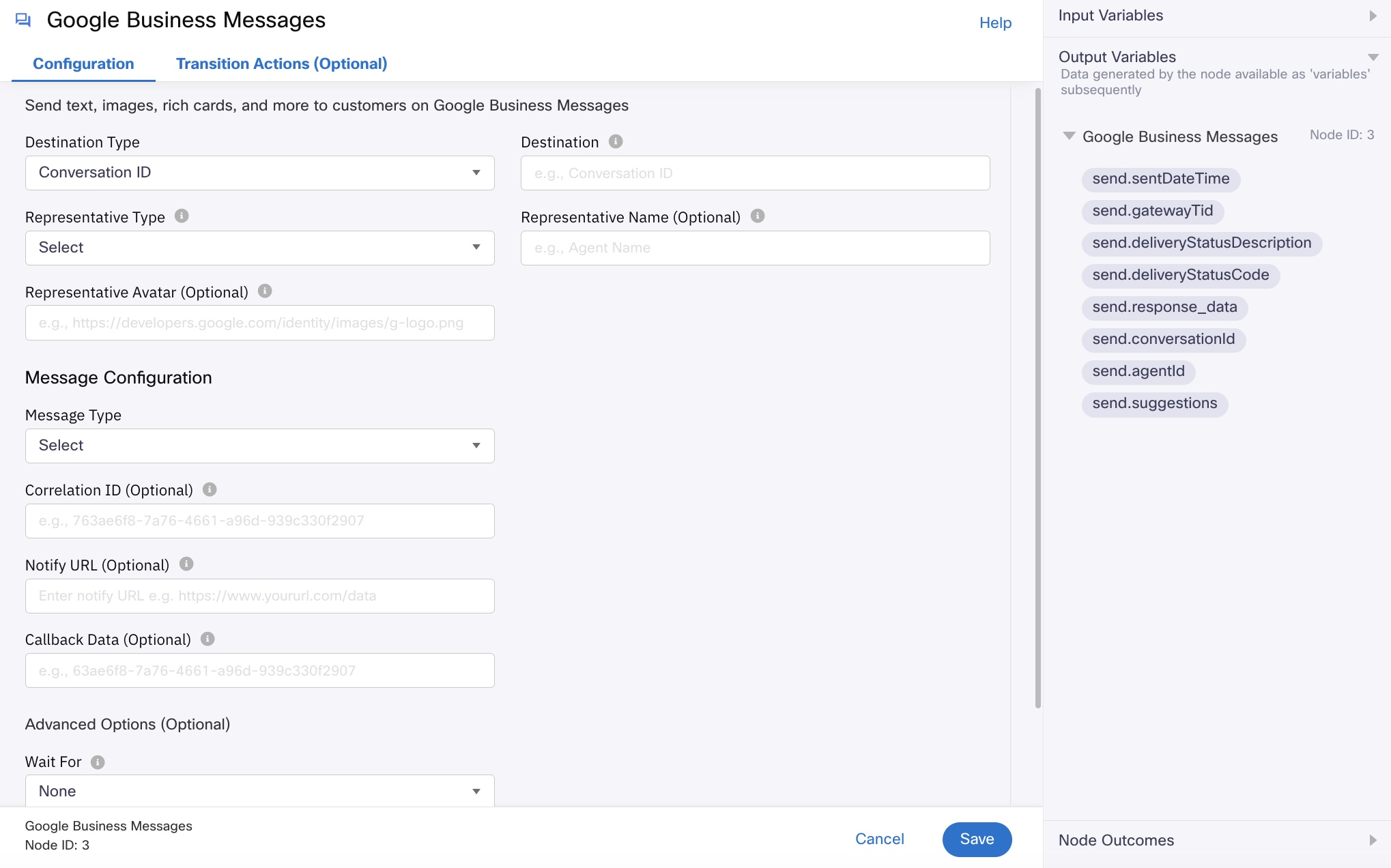
Node Configuration - Common fields for all message types
To configure the node:
-
Select Conservation ID from the Destination Type dropdown.
-
Enter the conversation ID in the Destination field. Conversation ID is the unique identifier of the conversation between a business and a customer. If the flow is triggered via an incoming message on Google Business Messages, you can find it in the Output Variables section of the flow Start Node.
-
Select one of the following from Representative Type dropdown. ‘Human’ must be used for scenarios wherein an agent is responding to a customer. ‘Bot’ must be used for sending responses from a chatbot.
- Human
- Bot
-
Enter the Representative Name based on the representative type selected. E.g., it could be variable that contains the name of the support agent, or simply the name of your support chatbot.
-
If you want to add an avatar to the representative, enter the publicly available url of the image in the Representative Avatar field. The image size must be of 1024X1024 pixels and the file size must not exceed 50 KB.
-
Select one of the following from the Message Type dropdown under Message Configuration. For detailed information regarding each of the message type click the links.
- Text Message - can include plain text or rich text to be sent to the customer.
- Image - an image message along with an optional thumbnail that can be sent to the customer.
- Rich card - a rich message type that contains image, title, and description.
- Carousel card - a collection of rich cards to present multiple categories of information to the customer.
-
Suggestions: These are the suggested actions provided to the user to send as a reply to the received message. This section is optional.
-
Select one of the following as Suggestion Type:
- Simple Reply: suggestion for the user to reply with specified text along with Postback Data.
- URL Action: an action that navigates to the provided URL (in step 'iv' below) on the user’s device.
- Dial Action: an action that dials the provided phone number (in step 'v' below) from the user’s device.
- Live Agent Request: request to have a live agent join the conversation.
-
Enter the Text to be shown in the suggested reply and sent to the chatbot or live agent when the user taps it. It can be of maximum 25 characters. This field is not available if you select Live Agent Request as Suggestion Type.
-
Enter the string for Postback Data, that the chatbot or live agent receives when a user taps the suggested reply. It can be of maximum 2048 characters. This field is not available if you select Live Agent Request as Suggestion Type.
-
Enter the URL that you want the customer to navigate to, when they tap on URL Action Suggestion Type you sent. This field is not applicable to any other suggestion types.
-
Enter the Phone Number that you want the customer to dial when they tap on Dial Action Suggestion Type you sent. This field is not applicable to any other suggestion types.
-
Click Add Another Suggestion and repeat steps i-v, if you want to add more suggestions. You can add upto 13 suggestions.
-
-
In the Correlation ID field, enter the unique reference ID to be passed back to you in delivery receipts for this transaction. This is an option field.
-
In the Notify URL field, enter the URL where you can receive delivery receipts for this transaction. This is an option field.
-
In the Callback Data field, enter any additional data that needs to be posted to the Notify URL. This is an option field.
-
Advanced Options (Optional)
- Wait For: Select the event to wait for on this node. The available options are None, Gateway Submit, Delivery Report, and Read. In case of timeout, the node will exit disregard of the configured wait for option.
- None: The default option, exits the node immediately after executing the send.
- Gateway Submit: Exits the node upon submitting the message to Google Business Message.
- Delivery Report: Waits until receiving the delivery receipt for the message sent.
- Read: Waits until the customer has read the message.
- Time Out: Maximum time in seconds until which the node should wait for one of the 'Wait for' conditions to be met. The node exits via the 'onDeliveryReportFail' node outcome edge when the set time elapses.
- Expiry: Select the message expiry format. The available options are UTC and Seconds.
- Expiry Date And Time: If you selected UTC, enter the message expiry date and time in YYYY - MM - DD T HH:MM:SS format. For example, if the value is set to 2019-23-04 03:06:48 AM, the message is suppressed if a send attempt is made beyond the set time.
- Expiry Time: If you selected Seconds, enter the maximum time in seconds within which the message must be submitted to Google Business Message.
- Wait For: Select the event to wait for on this node. The available options are None, Gateway Submit, Delivery Report, and Read. In case of timeout, the node will exit disregard of the configured wait for option.
-
Click Save.
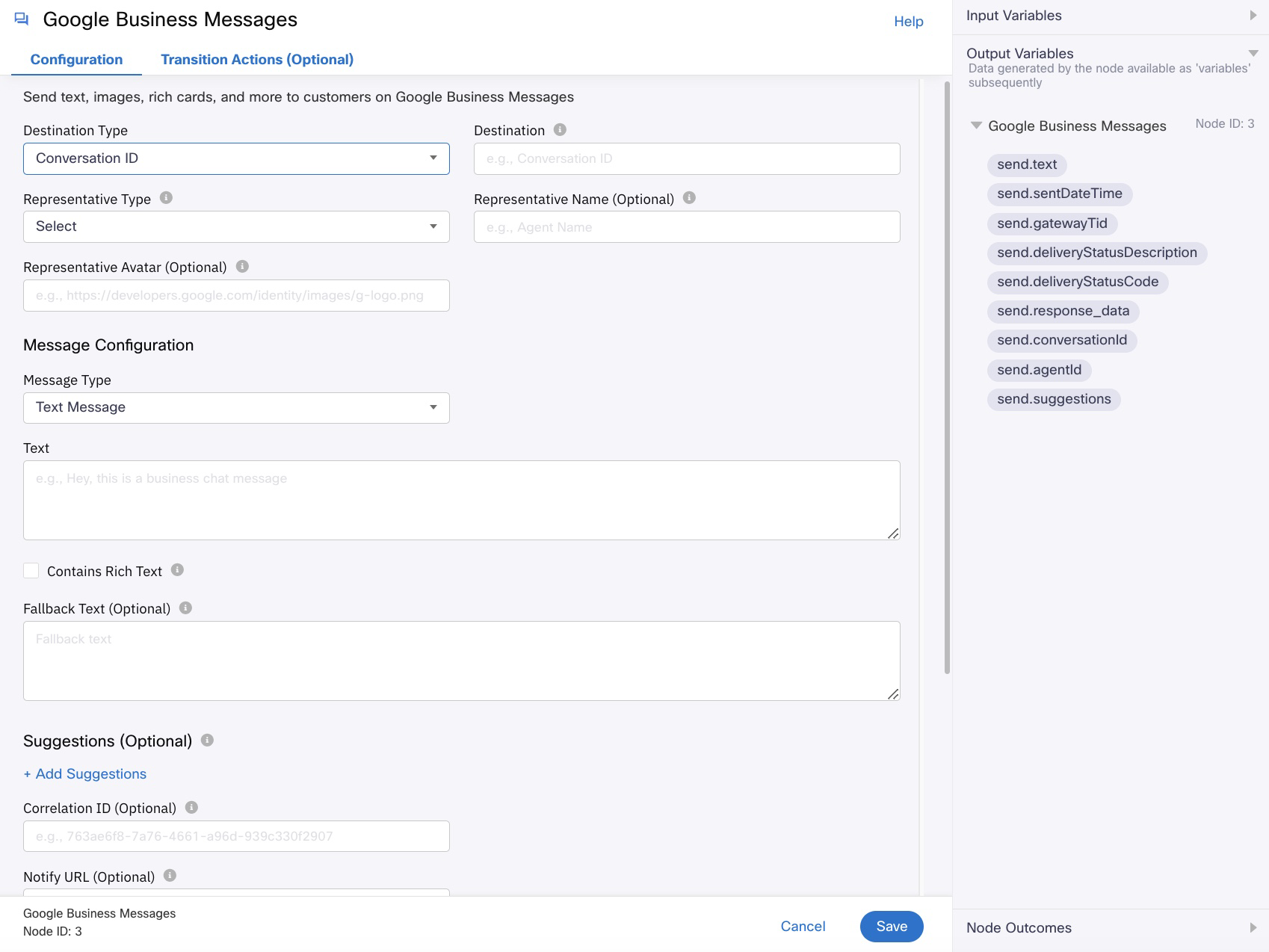
Configuring a Text Message
To configure text message:

- Enter the message in the Text field. It can be either plain text or it can contain rich text. To add rich text use text for Bold, text for Italics, text for Hyperlink, and \n for Line break in the message text.
- Select Contains Rich Text only if you want to send rich text, i.e., please do not use this option if you intend to send a plain text message, because it might fail to deliver. For example if you want to send the text “[Promotion] New Year sales are here“, and select Contains Rich Text, the message will fail since it does not follow hyperlink format.
- Enter the Fallback Text you want to show when the user’s device does not support this message type This is an optional field.
Configuring an Image
To configure image:
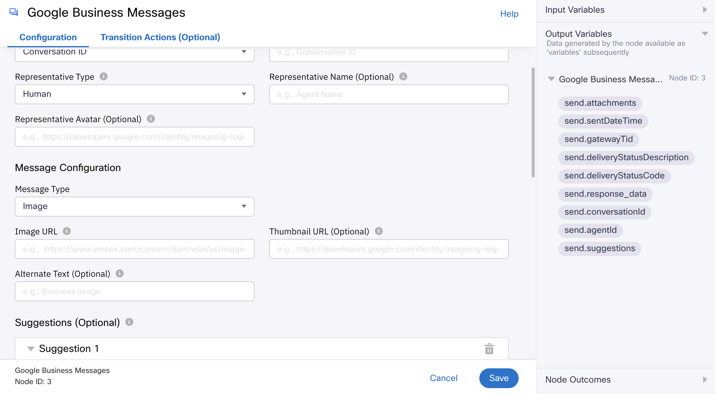
- Select Image from the Message Type dropdown under Message Configuration.
- Enter the URL that resolves to an Image. You may use a short-lived URL (if you want the URL to be more secure) in the Image URL field. The short-lived URLs are URLs which are valid only for a limited period of time.
The supported image types are JPEG, JPG, PNG, and WEBP. The image size must not exceed 5 MB. - Enter the URL of thumbnail in the Thumbnail Image URL field. Note that the short-lived URLs are not supported in the Thumbnail Image URL field. This is optional.
The supported image types are JPEG, JPG, PNG, and WEBP. The image size must not exceed 25 KB. - Enter the Alternate Text which you want to display as placeholder if the image is not available. This is optional.
Configuring a Rich Card
To configure rich card:
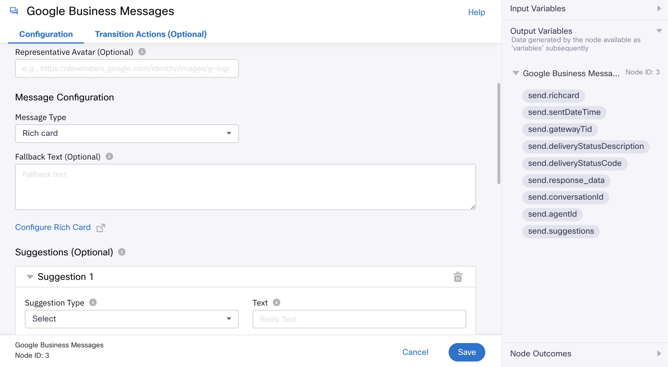
- Select Rich card from the Message Type dropdown under Message Configuration. It is an advanced message type that you can use when you need to send a set of related information, media, or suggestions to the customer.
- Enter the Fallback Text you want to show when the user’s device does not support this message type. This is an optional field.
- Click Configure Rich Card.
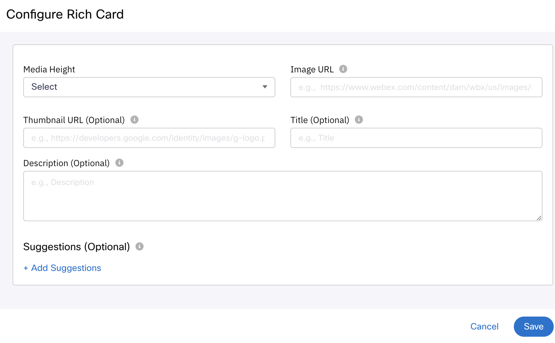
- Select one of the following as the Media Height:
- Short - Displays the image height at 112 DP.
- Medium - Displays the image height at 168 DP.
- Tall - Displays the image height at 264 DP.
- Enter the URL of the image in the Image URL field. The supported image types are JPEG, JPG, PNG, and WEBP. The image size must not exceed 5 MB.
- Enter the URL of thumbnail in the Thumbnail Image URL field. The supported image types are JPEG, JPG, PNG, and WEBP. The image size must not exceed 25 KB. This is optional.
- Enter the Title of the card. The characters in the field must not exceed 200. This is optional.
- Enter the cards content in the Description field. The characters in the field must not exceed 2000.
- Suggestions. This section is optional.
- Select one of the following as Suggestion Type:
- Simple Reply: suggestion for the user to reply with specified text.
- URL Action: an action that initiates to navigate to the provided URL (in step 'iv' below) on the user’s device.
- Dial Action: an action that initiates to dial the provided phone number (in step 'e' below) from the user’s device.
- Enter the Text to be shown in the suggested reply and sent to the agent when the user taps it. It can be of maximum 25 characters.
- Enter the string for Postback Data, that the agent receives when a user taps the suggested reply. It can be of maximum 2048 characters.
- Enter the URL to navigate to when URL Action is selected as Suggestion Type. This field is not applicable to any other suggestion types.
- Enter the Phone Number to dial when Dial Action is selected as Suggestion Type. This field is not applicable to any other suggestion types.
- Click Add Another Suggestion and repeat steps i-v, if you want to add more suggestions. You can add upto 4 suggestions.
- Select one of the following as Suggestion Type:
Configuring a Carousel Card
To configure carousal card:
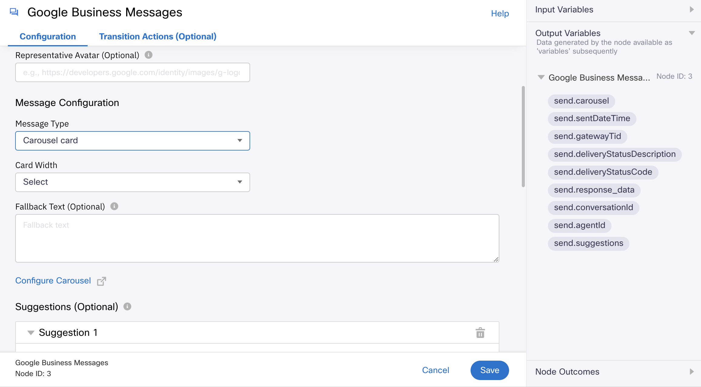
- Select Carousel card from the Message Type dropdown under Message Configuration. It can be used when you need to present the customer with multiple options to choose between. Carousels string together multiple rich cards, allowing users to compare items and react to each individually. The number of cards within a carousel should be between 2 and 10.
- Select one of the following as Card Width:
- Small - Displays the card width at 136 DP.
- Medium - Displays the card width at 280 DP.
Note: If the card width is selected as Small, then the media height of any of the cards should not be Tall.
- Enter the Fallback Text you want to show when the user’s device does not support this message type. This is an optional field.
- Click Configure Carousel. A pop-up appears as shown below.
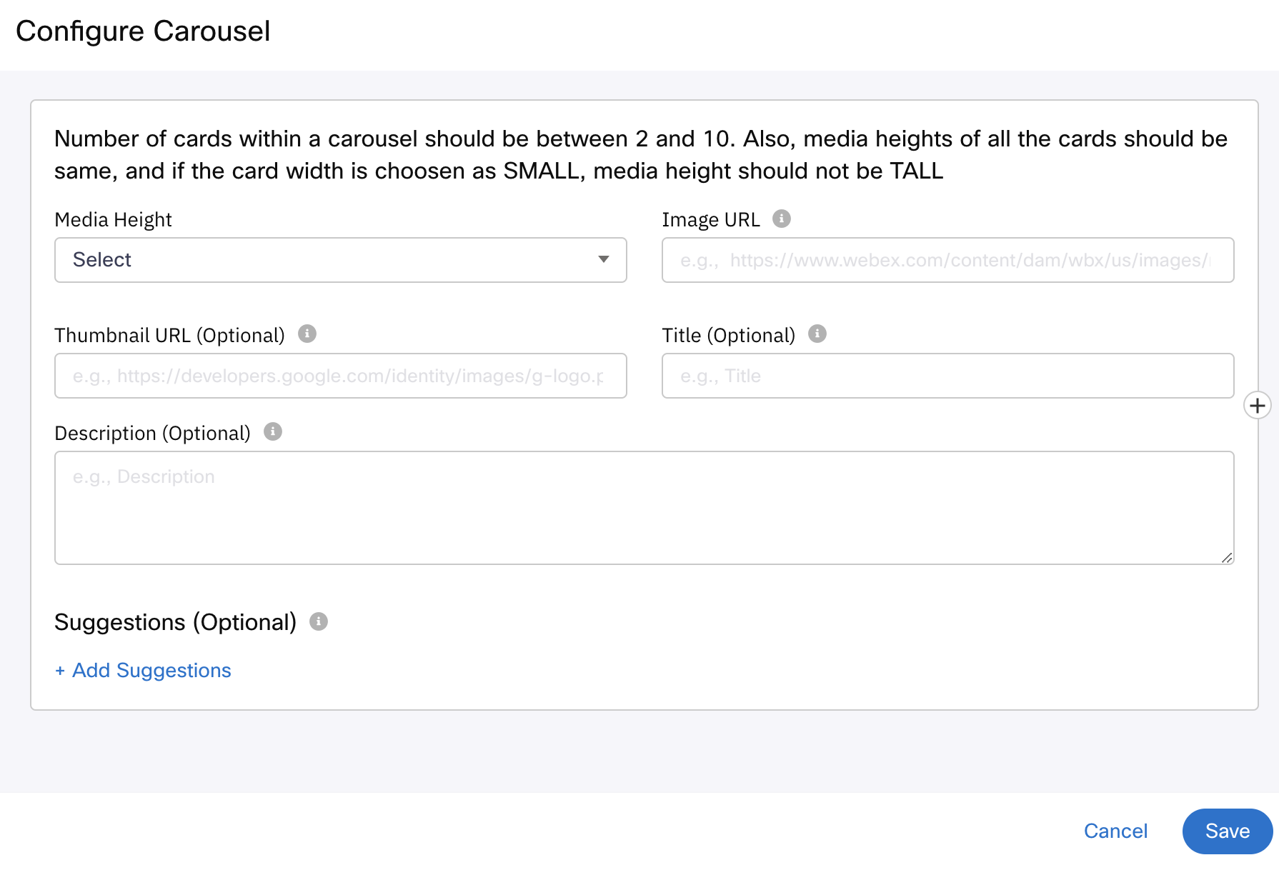
- Select one of the following as the Media Height:
- Short - Displays the image height at 112 DP.
- Medium - Displays the image height at 168 DP.
- Tall - Displays the image height at 264 DP.
Note: Please make sure that media heights of all the cards within the carousel are same.
- Enter the URL of the image in the Image URL field. The supported image types are JPEG, JPG, PNG, and WEBP. The image size must not exceed 5 MB.
- Enter the URL of thumbnail in the Thumbnail Image URL field. The supported image types are JPEG, JPG, PNG, and WEBP. The image size must not exceed 25 KB. This is optional field.
- Enter the Title of the card. The characters in the field must not exceed 200. This is optional field.
- Enter the cards content in the Description field. The characters in the field must not exceed 2000.
- Suggestions. This section is optional.
- Select one of the following as Suggestion Type:
- Simple Reply: suggestion for the user to reply with specified text.
- URL Action: an action that initiates to navigate to the provided URL (in step 'iv' below) on the user’s device.
- Dial Action: an action that initiates to dial the provided phone number (in step 'v' below) from the user’s device.
- Enter the Text to be shown in the suggested reply and sent to the agent when the user taps it. It can be of maximum 25 characters.
- Enter the string for Postback Data, that the agent receives when a user taps the suggested reply. It can be of maximum 2048 characters.
- Enter the URL to navigate to when URL Action is selected as Suggestion Type. This field is not applicable to any other suggestion types.
- Enter the Phone Number to dial when Dial Action is selected as Suggestion Type. This field is not applicable to any other suggestion types.
- Click Add Another Suggestion and repeat steps i-v, if you want to add more suggestions. You can add upto 4 suggestions.
- Select one of the following as Suggestion Type:
Node Outcomes
You can see the list of possible node outcomes for this node under this pane. The node exits through one of the node edges corresponding to the outcome of the node.
| Node Edge | Node Event/Outcome |
|---|---|
| Success (green) | onSuccess - the flow exits through this node when the message has been submitted. |
| Error (red) | onPolicyFail - the flow exits through this node when there is a failure in the policy. onError - the flow exits through this node when there is an error. |
Transition Actions
Use this tab to configure the transition actions for On-enter/On-leave events. However, configuring transition actions is optional. For detailed instructions about configuring the transition actions, see Node Transition Actions.
Updated 17 days ago